
Why This Daily Bruin Image Made Me Cringe
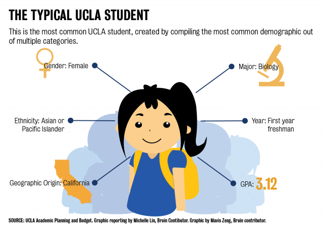
At some point last week, while scrolling through my Facebook feed, I came across the above image published in UCLA’s daily newspaper, the Daily Bruin. The image and its associated article argue that “there’s nothing wrong with being common and average”, a nice message.
At first glance this image seems admittedly very interesting, showcasing the “typical” UCLA student on several noteworthy axes including Gender, Major, and GPA. When I started really staring at it though, and understanding its implications, I became increasingly worried about the way data is depicted in other and future Daily Bruin posts.
Let me explain my concern. This image, as stated in bold at the top, was “created by compiling the most common demographic out of multiple categories”. That is, the image was created by taking the most common Gender, shown to be Female, the most common Ethnicity, shown to be Asian or Pacific Islander, most common Major, shown to be Biology, etc. This in itself is no issue, but what really worried me was that the most common demographics from each category were compiled under the pretense that “This is the most common UCLA student”. This is a statistical fallacy and misleading.
What’s so wrong about it?
I’ll explain with a more serious example. It is known that SAT scores and family income are not independent (see links at the end). That is, students coming from richer families do decidedly better on the SAT exam (a large factor in college admittance) than do students from low income families. This may best be attributed to limited access to often expensive study materials, classes, tutors, and the added time burden, which may detract from study time, associated coming from a low-income family. Let’s say that for some classroom of 100 students we have the following breakdown of students:
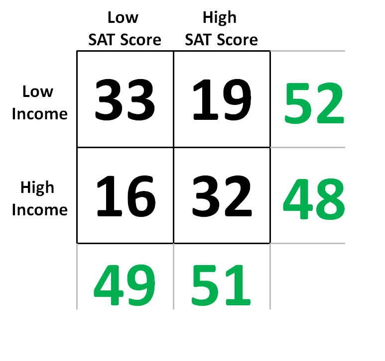
Let’s follow the Daily Bruin’s methodology of picking the “most common demographic” from each category.
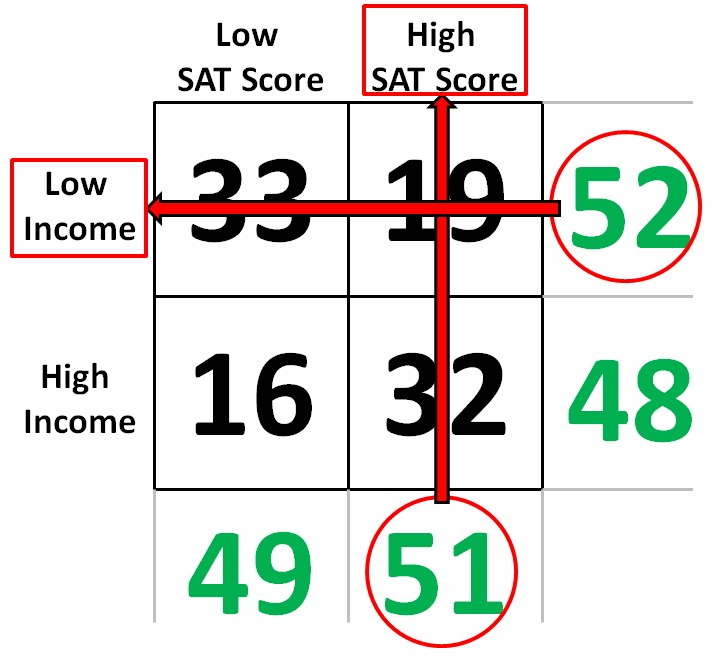
And now let’s present our picture:
Clearly something is very wrong here.
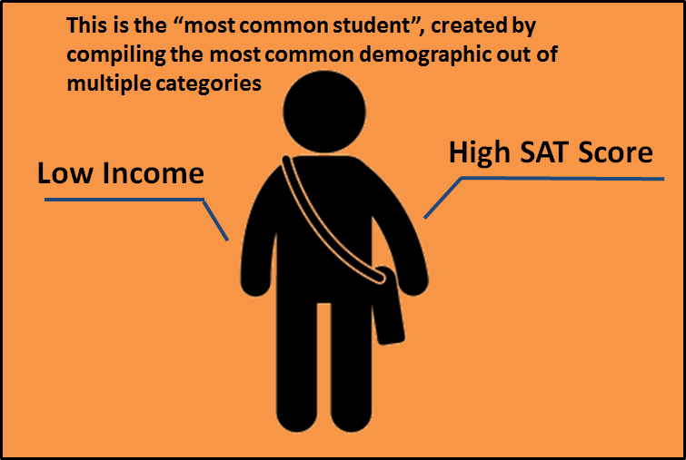
Someone looking at this picture will think that most students in the class come from low-income families and get high SAT scores and might then conclude that there is no issue. Why should we bother considering family income when looking at SAT score if “the facts” seem to say that students coming from lower income backgrounds are doing better anyways?!
In reality, we should be very concerned. In this class, only 37% of low-income students get high SAT scores while that number is 67% for high-income students. Along the same thread, 67% of those getting low SAT scores are low-income students while low-income students make up only 37% of those getting high SAT scores.
This type of analysis is not only misleading, it is irresponsible.
For a “cute” article like the one in the Daily Bruin (which is the only reason I would think for publishing such an article in the first place), I’ll agree, fine, no real harm done. The article has a somewhat positive, if highly misguided, message.
But, I worry less about this article in particular and more about the thought process at the Daily Bruin. Did no one check over this article before it was published? Did no red flags go off in anyone’s head that it might be misleading to point a bunch of labels to one student and label them as “the most common UCLA student”? I find it interesting that the article starts with a, justifiable, jab at our current president while the article itself falls prey to the same “false facts” that plague our current era.
I sincerely hope there are more oversights and peer reviews at the Daily Bruin for more serious articles than this piece.
See these articles for the correlation between SAT scores and family income.
These four charts show how the SAT favors rich, educated families