
The Rise and Demise of College Majors
Quick Links:
- Motivation
- The Data
- Is Your Major On the Rise or On the Demise?
- Can We Group Majors by GPA and Admit Rate?
- Which Majors are Getting Farther From Reach?
- So What?
Motivation

All undergraduate students are, at some point in their college careers, required to select a major, or field of study, which they would like to specialize in. This major is often a reflection of genuine passion, perceived lucrativeness, and even global shifts in interest. With that said, we might guess that demand for particular majors is not necessarily stable over time.
By identifying the majors for which demand is rapidly rising and those for which demand is rapidly declining, we can ask questions about what factors are causing this systematic education shift. All this begs the natural question of how to measure demand for a particular major. Should we look at college-side admissions statistics? Should we look at student-side application statistics? Is GPA a good indicator of demand? Well, they all seem like great ideas!
In this post, we will look at college applications to each major, college admissions by major, as well as the corresponding applicant and admittee GPAs, in order to analyze which majors are on the rise and which are on the demise.
The Data
We will use admissions statistics from a major US University, the University of California at Los Angeles (UCLA) for our analysis. The data comes from the UCLA Admissions Website website.
The data spans the years 2003 until 2016 and includes fields such as counts, GPAs, and units for applicants, admittees, and enrollees. The data for Fall 2015 and Fall 2016 contains a more limited view with only data for applicants and admittees. It is important to note that this data pertains to transfer students who transfer into UCLA from other universities, typically community colleges.
Is Your Major On the Rise or On the Demise?
The tool above lets you go wild and explore which majors are on the rise in terms of number of applicants, applicant GPA, admission rate, and admitted student GPA. There is a lot of information contained here but let’s just highlight some of the key takeaways.
-
Majors which have a growing applicant rate, decreasing admission rate and a growing admission GPA can be thought of as having “increased demand”. Indeed, these majors are attracting more and more applicants, which perhaps the university did not prepare for. In response, the university may have accepted a similar number of students from that major as before, which explains the lower admit rate. In addition, the university would have the ability to raise its admitted GPA with so many more applicants.
-
We can reverse the above story to find majors which are on the decline. Indeed, if fewer and fewer students are applying to a major, the university might have to raise its admit rate to maintain a similar number of students from that major. It might also have less flexibility to choose very high performing students in this case.
-
We can also check the growth rates of applicants over time to find out which majors are attracting the most students over time. From a quick survey, we see that majors such as Computer Science and Economics fit this description. It is also important to note that there are majors which aren’t necessarily growing in terms of percent applicants, but have a huge and stable share of the applicant pool over time. In particular, Psychology consistently has ~9% share of the applicant pool over the last 14 years.
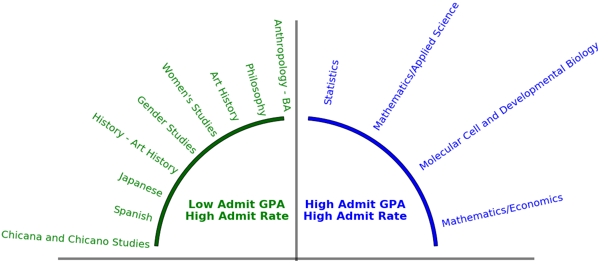
Can We Group Majors by GPA and Admit Rate?
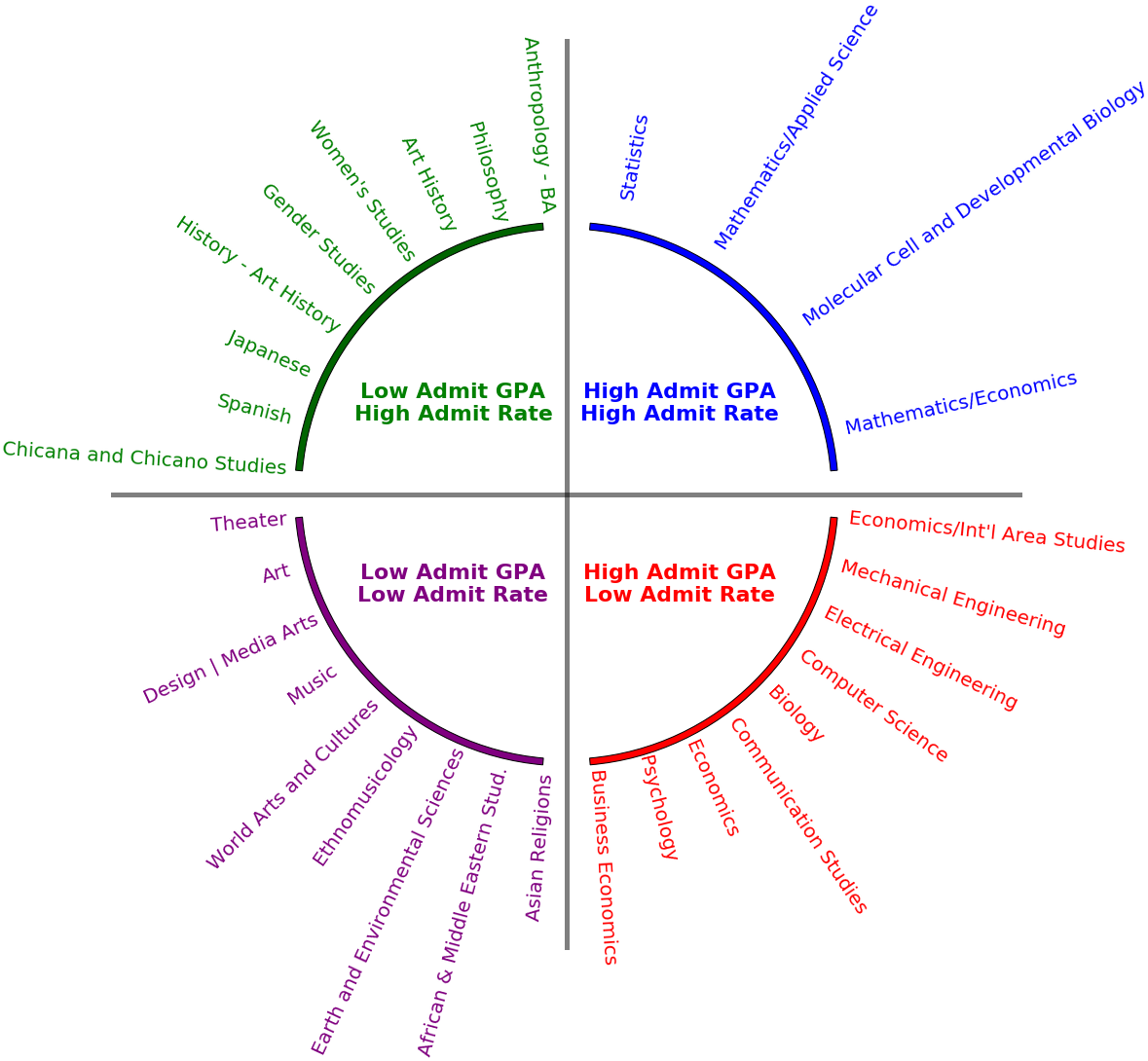
The figure above aims to group majors into four categories based on two factors, admit GPA and admit rate. The methodology is as follows. We compute the average admit GPA and the average admit rate for all majors over all years. We then check which majors are above and below each of these averages (with a margin of tolerance around the averages). For space reasons, we only display the majors in each of the four categories with the highest applicant rates.
How can you use this data to your advantage:
-
Let’s say you’re an applicant hoping to pursue the medical profession. Perhaps you don’t care too much what your exact major is as long as it is within the medical field. Suppose also that you have a fairly high GPA. Which is the best major for you? Well, let’s look at Biology and Molecular Cell and Developmental Biology. Both require a high GPA, which you have. But, the latter has a high admit rate while the former does not. How stark is this difference? Well, looking at the data, Biology has an average 22% admit rate while for Molecular Cell and Developmental Biology this figure is 51%, more than twice as much! Also, their average admit GPA is the same, at 3.67. Applying to Molecular Cell and Developmental Biology boosts your odds of admission by a factor of 2.3 all else constant.
-
Let’s say now that you are a student whose top priority is to get into the university. Your major is indeed important but you, for one reason or another, are just concerned with getting a degree. You thus care most about the admit rate for the major you apply to being high. Unfortunately, your grades have been slipping and there isn’t a lot of time to boost them before application time. Thus, you would be most interested in majors in the green area in the above figure.
Which Majors are Getting Farther From Reach?
After playing with the dashboard above and looking at applicant GPAs vs. admit GPAs, you have probably found that applicant GPAs tend to be lower, sometimes much lower. This itself is not a surprise since colleges usually pick the students in the applicant pool with the highest GPAs. But, it does lead to an interesting question: For which majors is the gap between admit GPA and applicant GPA getting larger over time? For majors where this gap is getting wider and wider, hopeful applicants just cannot get their GPAs to keep up with the GPAs that UCLA requires.
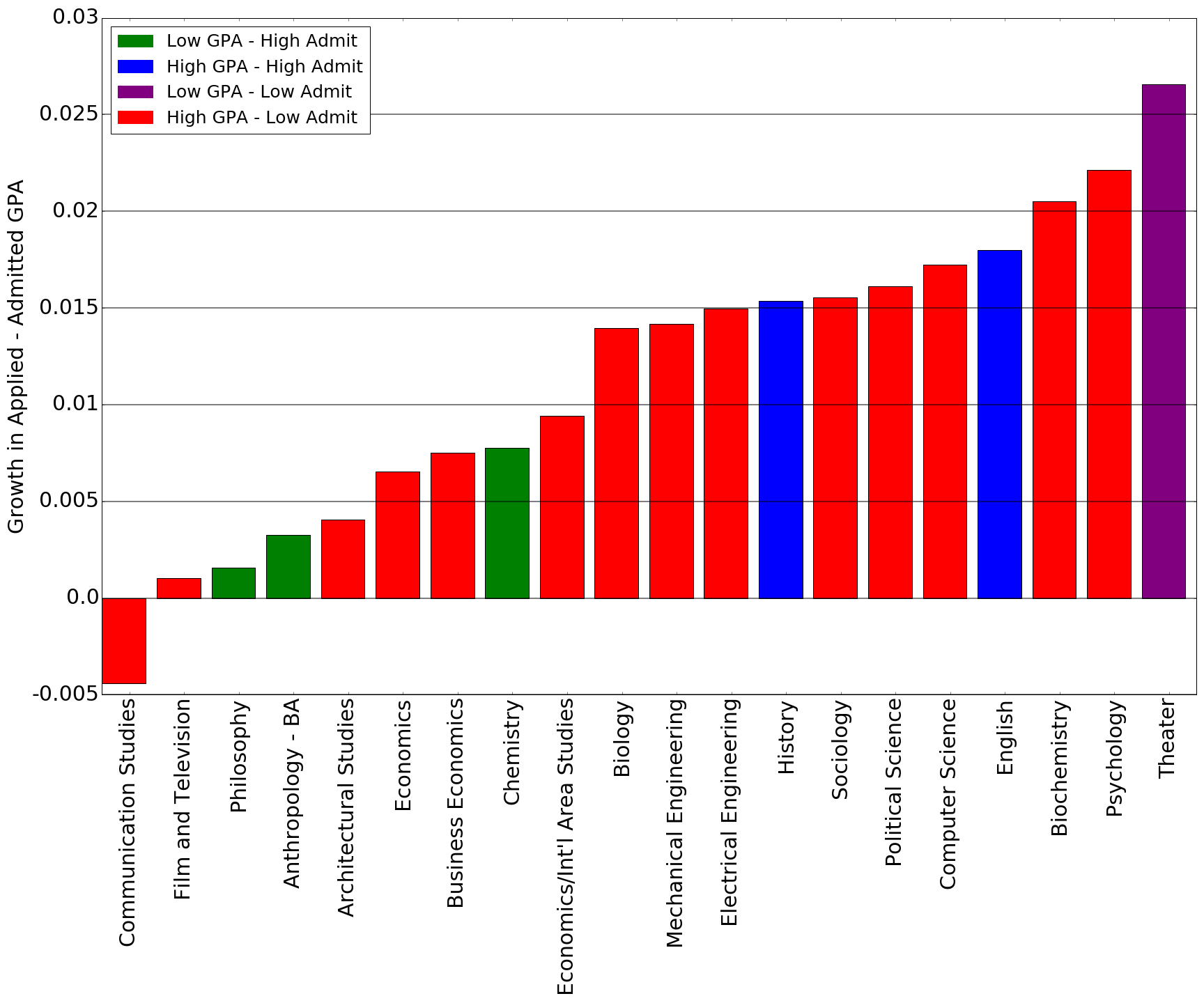
Perhaps there is the opposite trend as well. That is, perhaps there are majors where the applicant GPA is growing faster than the admit GPA, so that applicants are more than able to keep up with the GPA that a major demands. Before looking at growth though, let’s get an idea of the size of this admit-applicant GPA gap for each major. We simply compute the gap for each year and then take the average across all years. We first show the results for the top 20 majors by share of applicants.
Note that the color of each bar corresponds to the colors in the figure in the previous section.
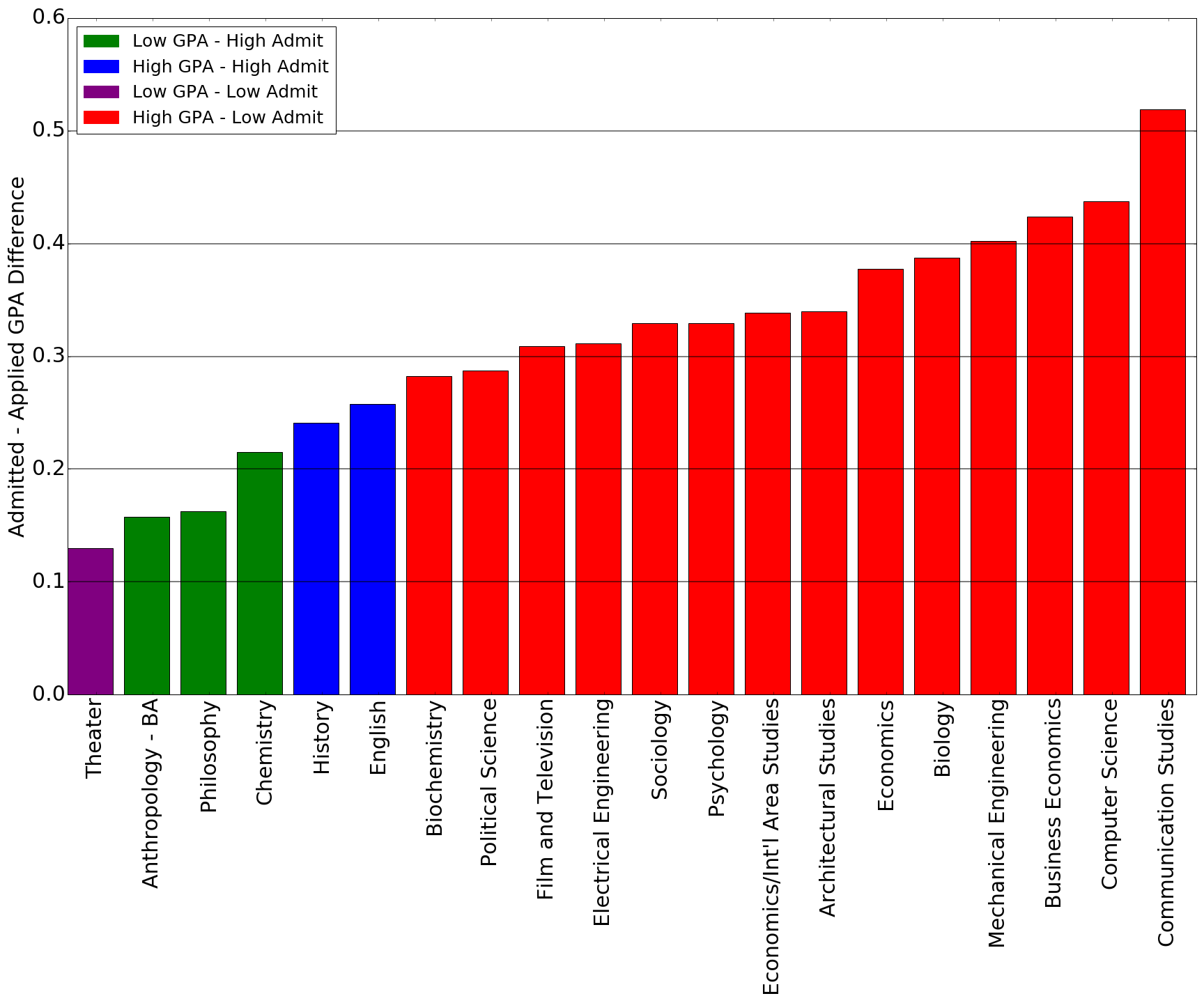
-
We see, perhaps expectedly, that the red majors, those with high admit GPA and low admit rate, have the greatest gap. This is likely a consequence of the fact that applicants are free to apply to any majors regardless of their GPA, whereas the university sets very different GPA requirements for each major.
-
We see a well-defined clustering of the four colors.
Let’s look at all the majors now to see if there is any clustering of colors overall.
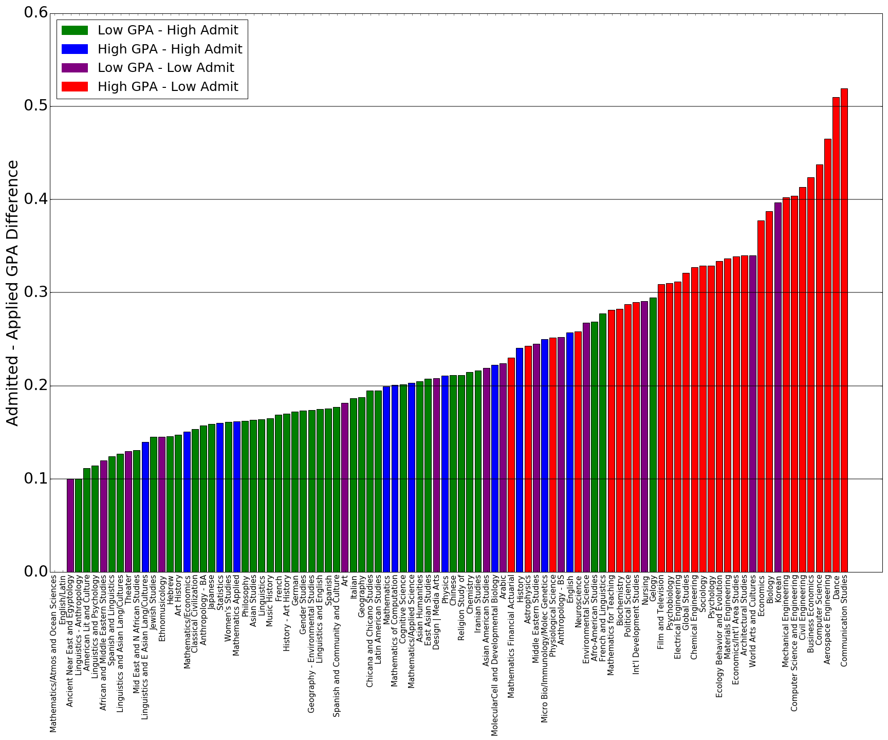
- As expected, we see that most (but not all) green majors occur before the red majors. The blue and purple majors are dispersed throughout without too much of an obvious pattern.
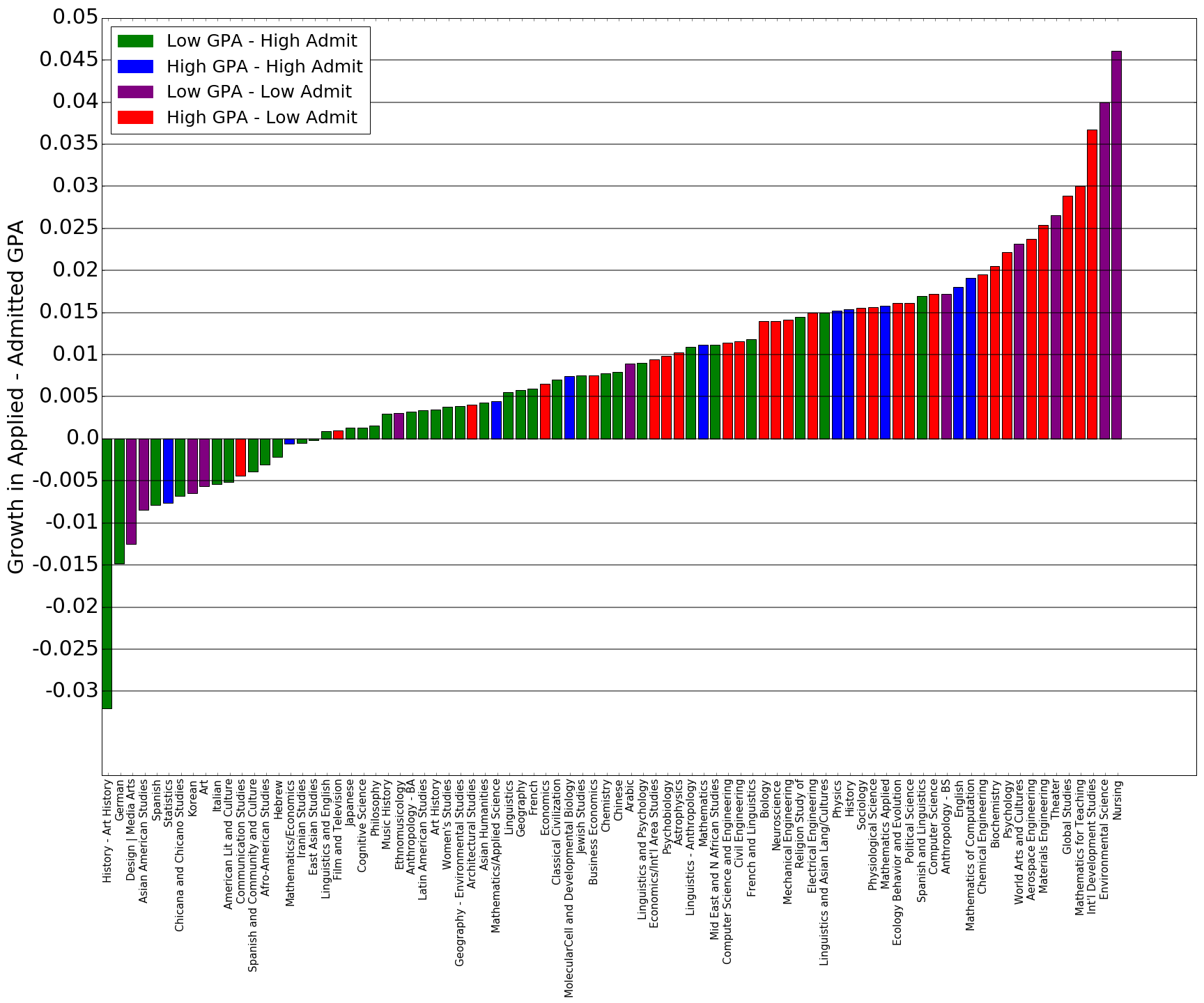
Now, let’s get on to the main event, the growth in this gap over time. The methodology here was also simple. We fit an Ordinary Least Squares line to the data of Year vs. GPA gap and computed the slope of this line for all our majors. The steeper this line, the faster the gap is growing over time and the shallower the line, the slower the gap is growing. Negative values for slope indicate a trend that the gap is actually shrinking.
Let’s again first look at the top 20 majors by applicant share.
-
We see that although Communication Studies has the highest average gap in our above chart of 20 majors, here we see that this gap has actually been shrinking over time.
-
We see that although Theater has the lowest average gap in our above chart of 20 majors, here we see that this gap is actually increasing quickly over time.
Let’s look now at all majors.
-
We see that for most majors, the gap is increasing, but for many majors, the gap is indeed shrinking over time.
-
We see that the high admit GPA, low admit rate red majors tend to have higher growth rates and the low admit GPA, high admit rate green majors tend to have lower growth rates.
-
The purple low admit GPA, low admit rate majors tend to cluster around the very high growth rates and the very low growth rates.
So What?
What does it all mean? Does this mean you need to change your major because it wasn’t the “right” color in the charts above?
No.
As students, we often find ourselves in academically intensive environments where metrics such as GPA, test scores, and earnings potential are valued over metrics such has mental health, physical well-being, and happiness. It can be easy to fall into the trap of picking the “right” major, which can lead to feelings of self-doubt and worthlessness. This author will admit he has been there himself.
In reality, these metrics such as GPA and test scores are important; otherwise they would have been devalued by our educational institutions long ago. But, there are metrics regarding each major that this post did not capture and perhaps resist capture altogether. These metrics, passion, feelings of accomplishment, drive to get out of bed in the morning are critical in the development of the self in ways that GPA can never be.
Perhaps then the idea is to strike a medium. Yes, follow your passion but get creative in how you do it. Do it in such a way that you are able to support yourself financially and remain relevant to this changing world. Do it without compromising your core values. Do it so that you challenge yourself each day. Perhaps that is where success lies.

Thanks for reading and please leave comments!