Unearthing Hidden Biases in SAT Exam Scores

Quick Links:
- Background and Data
- How Do SAT Scores Vary Based on Subject, Family Income, School Size, etc.?
- Do High Schools Cluster Geographically by SAT Score?
- Can We Build a Model to Predict SAT Scores?
- Summarizing Features of High and Low Performing Schools
Background and Data

Every year, about 1.7 million college bound high school seniors take the SAT exam, often cited as a major factor in college admittance. Prior to 2016 this exam consisted of 3 sections: reading, math, and writing and was graded out of a maximum possible score of 2400. From 2016 onward, the exam has changed in various ways but since the data we use is from before 2016, we will disregard these recent changes. While students can and do study extensively for the SAT, there are other factors at play which make this test less than fair for all students.
The most cited of these is family income. It is known that students coming from richer families perform better on average than students coming from poorer families. This should not be a great surprise given that wealthier students are more readily able to enroll in very expensive SAT preparation courses or hire private tutors. Income disparities can also have less overt implications. For example, students from poorer families might need to work a part time job while in high school to meet family income needs, detracting from study time for the SAT and school in general. These are indeed theories which are backed by evidence: here and here.
Of course, other factors can also have an effect on SAT score including school size (maybe larger schools have more resources), school hours (maybe it helps to be at school longer), the SAT score of neighboring schools (maybe schools cluster geographically by SAT score), etc. We will analyze data from the New York City Department of Education and the College Board to check for these patterns across the public high schools in New York City for the 2014-2015 school year. The data can be found here.
Each row of the data represents one public high school in New York City and includes features such as total school enrollment, school latitude and longitude, percent of students who took the SAT at this school, racial composition of the school, school hours, and average school scores in SAT math, reading, and writing.
We join this data to another dataset about median family income in various regions within New York City. This will allow us to perform an income analysis later on.
How Do SAT Scores Vary Based on Subject, Family Income, School Size, etc.?
We want to first understand how SAT scores vary by various school dimensions namely: school size, percent of students who took the SAT, and median family income of the neighborhood the school is in. For each of these dimensions, we categorize a school as either high, medium, or low and look at the average SAT math, reading, and writing score in each bucket.
School Size
We start with total school enrollment. Is it more likely that a larger school or smaller school will have better average SAT scores? We can argue for either side. Perhaps larger schools have more resources to provide students. On the other hand, perhaps smaller schools offer a more intimate learning environment with a better student to teacher ratio. Let’s turn to the data.

- We see that in general, the scores rise as the size of the school increases, possibly due to our theory of larger schools having more resources to give students. Or perhaps larger schools are just located in more high income areas.
- Note also that SAT math seems to increase faster than the other subjects.
Percent Tested
We turn our attention now to the variance in SAT scores based on what percent of students at a given school took the SAT exam. We expect that if a large fraction of students at the school take the exam, the school is likely more academically advanced in general than if a low proportion of students take the exam and so we expect higher scores in this case. What does the data say?

- We see that math is actually lower in the < 33% case, but grows at a much faster rate, eventually beating the other subjects by a large margin.
- We see that there is a bit of a change between the first and second school groups but a very large change between the second and third. That is, having more than 67% of students take the SAT at a school seems to be correlated with relatively very high SAT scores.
Family Income
Saving the best for last, we now look at how SAT scores change based on median family income in the region that the school is in. Following our discussion in the introduction, we expect that higher income leads to higher SAT scores. Again we partition the schools into low, medium, and high income bins. What’s the data tell us?
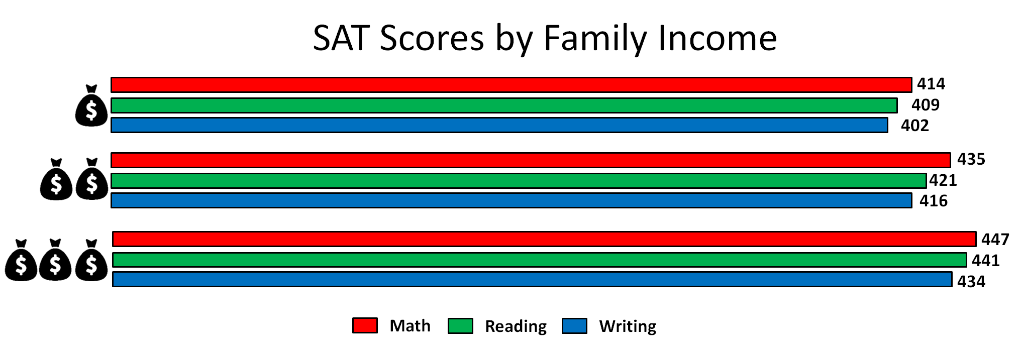
- Note that the combined average SAT score for the high income schools is nearly 100 points more than the combined average score of the low income schools.
- We see that the ratio between reading, math, writing remains roughly constant regardless of income bin.
- Note that this income might be off the mark since it is aggregated for the region that the school is in, meaning that there will still be some low income students at schools in high income areas and high income students at schools in low income areas. Also, the school itself might be underfunded even if it is in a high income area, or vice versa. It is thus important to take these results with a grain of salt.
- Still, we see a clear positive correlation between SAT score (all subjects) and median family income of the region that a school falls in.
Correlations Between Subjects
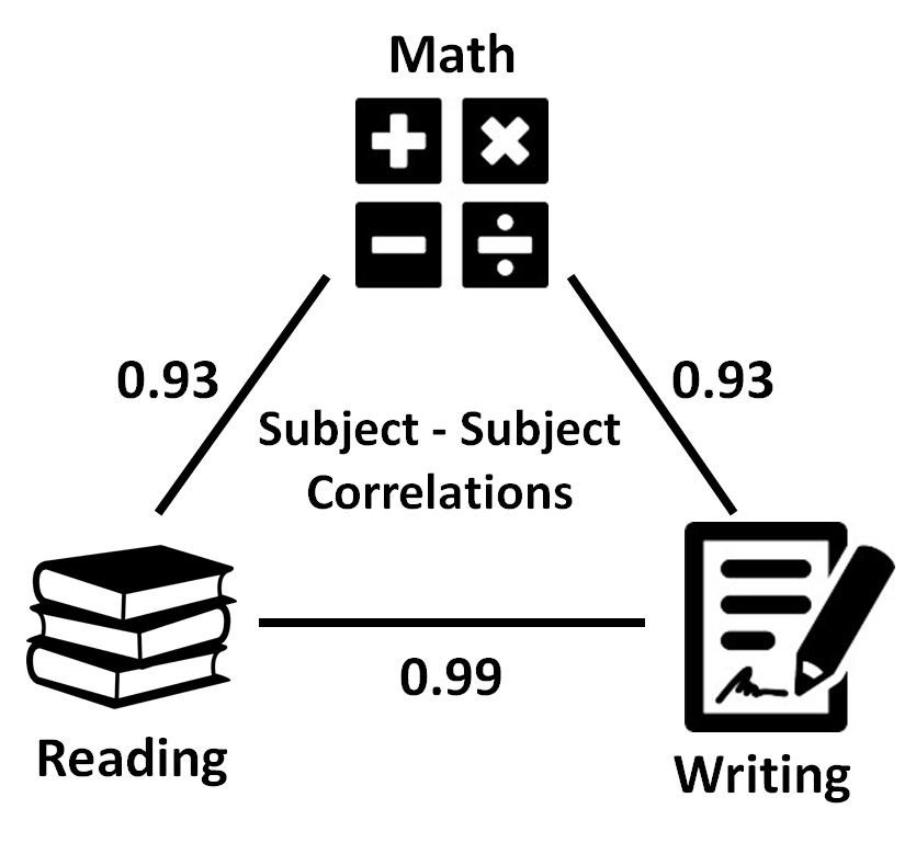
It is no surprise that the three SAT subjects seem to “move together” in all the dimensions above. If we just compute the correlation coefficient between each pair of the three subjects, we get the following results. It is intuitive that reading and writing, which share certain skills, are more correlated than either is to math.
Do High Schools Cluster Geographically by SAT Score?
An aspect of high schools and SAT scores we have not yet considered is geographic location in New York City (NYC). It is known that NYC is comprised of five boroughs: Manhattan, the Bronx, Queens, Brooklyn, and Staten Island, each with its own culture, racial composition, and history. Additionally, schools often cluster into districts, which have similar standards, rules, and regulations and whose schools are in close proximity to each other. We might see these effects as well when we look at the SAT scores of neighboring schools compared to distant schools. Enough talk! Let’s see some maps!
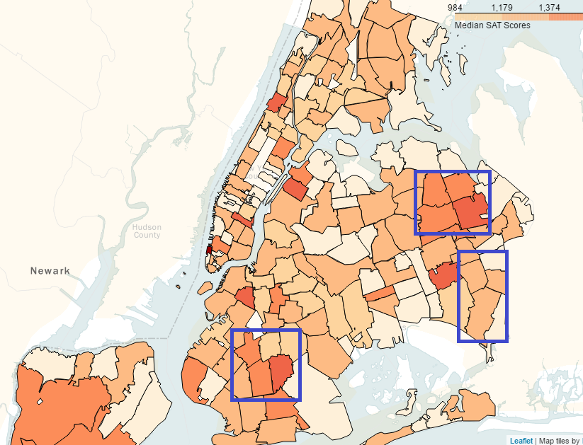
Let us first look at purely a map of Average SAT score by region in NYC. Click, Drag, Zoom!
There is a lot going on in the map above! Let’s highlight some areas of a possible spatial correlation between SAT scores at one school and those at nearby schools.
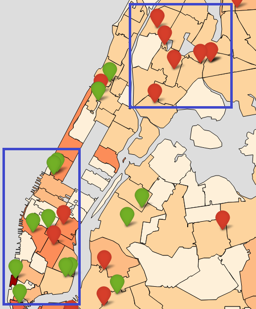
Now, let’s throw in data about median family income in each region. In the map below the shading represents median family income in that region. In addition, we display the top 20 schools by SAT score in green and bottom 20 schools by SAT score in red. Click on each marker for the school’s average SAT score!
Again, lots going on! Let’s highlight two areas of interest. The lower area shows predominantly high income areas and many green markers, or top performing schools in those areas. To be fair there are a few bottom performing schools in that area as well. In the top highlighted area we see generally low income areas and many of he bottom performing schools. These trends together give us some affirmation that SAT scores are subject to systemic regional differences in family income.
Can We Build a Model to Predict SAT Scores?
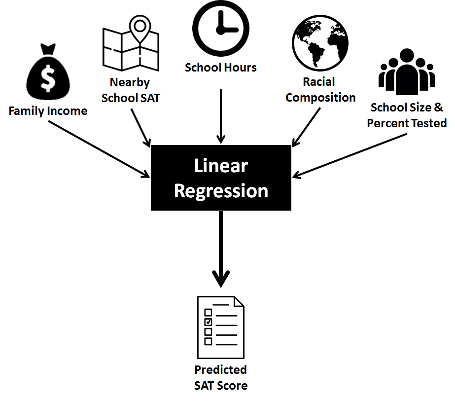
Of course you wouldn’t be on ritvikmath.com if there wasn’t at least some machine learning to be tried. Here, our goal is a natural one. We want to know, given all the information we have about each school such as total enrollment, school hours, neighborhood family income, school racial composition, percent of students tested at the school, and SAT score at the nearest school geographically, can we build a simple enough model to predict the SAT score of a hypothetical new school?
Ethics Break!
The application of such a model is immediate and possibly ethically ambiguous. This model would allow us to predict the average SAT score of a given school based on factors such as neighborhood, race, and income, which might prompt officials to approve or deny building schools where they are likely most needed just because the SAT scores might be too low and risk hurting the district as a whole.
Still, it would be interesting to see whether this prediction is even a good one or if this problem eludes an accurate prediction.
For our model, we will not be doing anything too fancy. We will be using an Ordinary Least Squares model to predict SAT score based on the above features. We split our 375 schools into a training group of 200 and a testing group of 175. As a caveat, note that for the schools in the testing set, we can only use as a feature the SAT score of the nearest school in the training set. Otherwise, if the closest school is a school in the testing set, and we use this score, we implicitly assume that values in the testing set are known, which is incorrect.
A summary of our features and methodology are shown below.
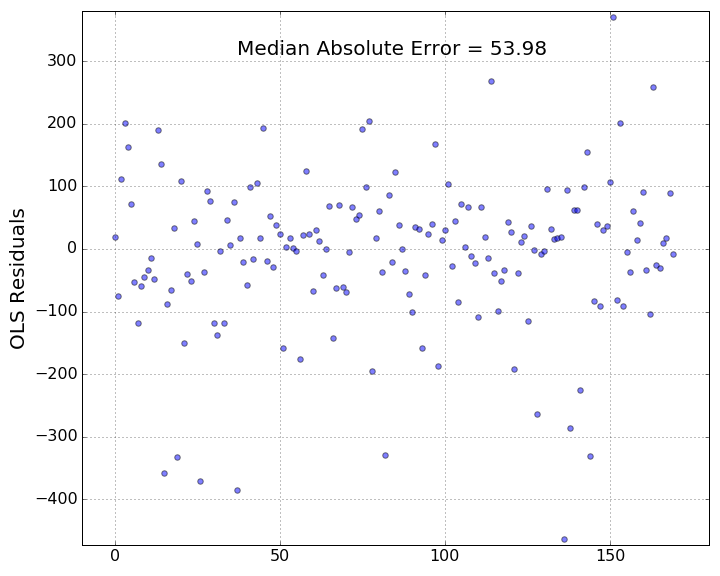
Of course, as with any regression problem, the goal is not to get a prefect prediction but rather one where we minimize as much as possible some error metric. Here we use the median absolute error, defined as the median absolute difference between each predicted value and the true value of the SAT score. A plot of our residuals is shown below and the median absolute error here is nearly 54 meaning that our model, with all its features, is “on average” 54 SAT points away from the true value. Given that the exam is out of 2400, this does not seem too bad. Of course, looking at the plot, there are some predicted values which are very far away from the true values.
Summarizing Features of High and Low Performing Schools
Just as we considered the top performing 20 schools and bottom performing 20 schools by geographic location, we can also analyze summary statistics about these two groups. That is, for the top 20 schools and bottom 20 schools, we can analyze average family income in surrounding area, average school enrollment, and average fraction of students who take the SAT at these schools. Our goal is to understand just how stark the differences are between schools.
We summarize our findings below.
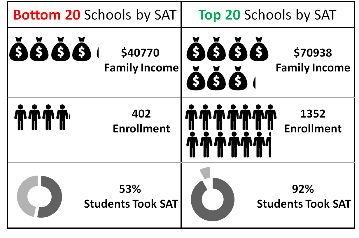
- For family income, we see that the average for the top performing schools is $30,000 more than it is for the bottom 20 schools, again affirming our idea of family income being at least correlated if not causal of variance in SAT scores.
- For total enrollment, we see that the top performing schools have more than 3 times as many students as low performing schools. This relationship points to an inherent advantage of large schools whether it be due to more funding, resources, or simply by virtue of being in a higher income area.
- For percent tested, we see a huge gap between this value in low performing schools versus high performing schools. In fact, nearly all students at the top 20 schools take the SAT while at low performing schools it is, on average, only barely over half of all students. This again is likely correlated with other factors such as income of the area or school size.
In conclusion, there are a wide variety of factors at play, besides inherent student ability or academic achievement, which affect students’ SAT scores. More populous schools house higher performing students. Schools where more students are taking the SAT host high performers as well. As suspected all along, areas where family income is high, where schools are attended by wealthier students, boast higher SAT scores. And, furthermore, we see that for schools on either end of the SAT score spectrum, these aforementioned quantities are often severely polarized to the point where these differences cannot arise by chance.
For an exam that is so heavily used to determine college admissions, we need to be well aware of the biases that skew this exam in favor of some students and not others. We need to understand, beyond just the correlations, why they might arise and if they represent systemic differences in racial, social, and economic groups.
Thanks for reading and please leave comments below!
