
Salary Dynamics in the University of California
Disclaimer
The raw data used for this analysis is publically available and contains names, job titles, and salaries for all University of California Employees from 2010 until 2015. Before performing any analysis on the data, this author encrypted all names. If this data is released, the encryption will remain in place and no names will be published.
Although all the data is available online, there is a fundamental difference between having to search for data, point by point, in a database and having all the data aggregated into a spreadsheet where searching is much more simple.
Quick Links:
- Background
- The Data
- Who is paid the most at each school?
- How do UC campuses compare globally?
- What is the distribution of salaries for each campus?
- How does value flow between UC schools?
- How does salary correlate with other things?
- Notes
Background
The University of California (UC) system is a public university system comprising of ten campuses, with the oldest being UC Berkeley, founded in 1868 and the newest being UC Merced, founded in 2005. Nine of the ten schools in the UC system admit both undergraduate and graduate students, with the exception of UC San Francisco, which admits only graduate students.
The UC System was allocated a budget of \$25.5 billion in 2015, \$13.1 billion of which went towards paying its around 180,000 employees. Of course, there are various factors that impact each individual employee’s salary such as position and years of experience.
But, there may be more, underlying, factors which impact employee salary, all else held constant, such as UC Campus, city unemployment rate, and cost of living. This post aims to dive deep into the intricacies of the distribution of salaries throughout the UC system, offering an interactive way to explore the key dynamics at play.
The Data
The data for this analysis came from the Compensation at the University of California website. The data includes employee names, campus of employment, job title, and gross pay. A snapshot of the data is shown below.
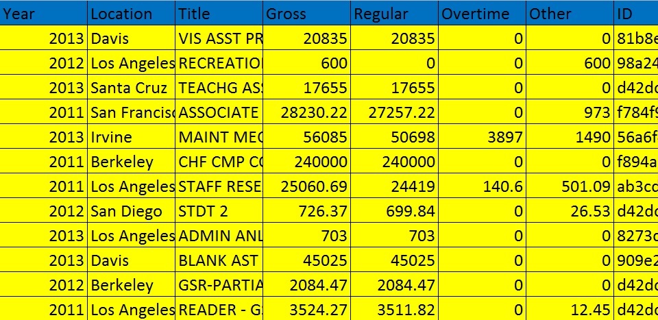
The data spans the years 2010 until 2015 and includes all ten UC Schools as well as the University of California Office of the President. In total there are about 1.5 million rows in the table, where each row corresponds to a particular employee in a particular year.
Brief Notes on the Data
- Employees who are concurrently students have their names listed as ‘*****’ in order to protect their privacy. For this reason, we will use them when calculating summary statistics for each campus, but must remove them when we try and track certain employees through time since we have no unique identifier for them.
- The job titles are not very specific and usually are limited to things like ‘COACH’ or ‘PROF’ without much more detail about which sport, department, etc. the employee is a part of.
- There are a few missing values in the data for salaries. This author chose to use median imputation to fill in these missing values. Basically, missing values for any column are filled in with the median of existing entries in that column.
Who is paid the most at each school?
One of the burning questions readers probably have is “Who is paid the most at each campus?” Let’s answer this question before going much deeper into the data as a whole.
By clicking on the column names, you can sort the table by salary, position, or campus.
Perhaps the most striking thing about this table is that the sum of the five lowest salaries still is less than the top salary, that of a head coach at UC Los Angeles.
Let’s now step back and look at our plethora of data as a whole.
How do UC campuses compare globally?
There are inherent disparities between salaries at UC campuses and moreover, these disparities change over time.
Use the tool below to explore for yourself some of these differences in salaries over time and between campuses.
There are a few key points about this global data:
- Number of students and employees generally goes up over time, the UC system is growing.
- There is actually a huge difference between median and mean salary. For example, UC Merced’s mean salary in 2015 is around \$28,000 but its median salary is only \$8,850. Big differences between medians and means usually indicate strong presence of outliers (high salary earners) pulling the mean to high values.
- The fact that UC San Francisco is a graduate school really shows as it has few students but has by far the highest mean and median salaries.
- There seems to be a somewhat positive correlation between number of students / employees and mean / median campus salary.
- There seems to be a somewhat negative correlation between number of students / employees and unemployment rate. Hmm …. more on this later.
What is the distribution of salaries for each campus?
Let’s zoom in a bit and look at the distribution of salaries within each campus and over time. As you play with the tool below think about questions like “Does the salary distribution shift over time towards higher or lower earners?”, “Which campus has the most equality in pay?”, “Are there intermediate peaks or valleys in these distributions?”
If there is no graph, give it a second. 1.5 million rows of data takes a bit of time to load!
There is a lot to be said about these distributions but let’s note some of the more prevalent points:
- In general the histograms display an expected exponential decay-like pattern, with many employees having lower salaries and with fewer and fewer employees having high salaries.
- Most UC schools such as UC Los Angeles and UC Davis have a “middle-earner” bump around \$50,000 in 2015.
- This bump is most profound in UC San Francisco, which has a very unique salary distribution compared to all the other schools. In fact, most employees at UC San Francisco earn around \$50,000, much higher than at other UC schools.
- Many UC schools, such as Irvine, went from having clear twin peaks in 2010-2011 to having much smoother distributions. That second peak around \$30,000 seems to have been absorbed into lower salary brackets over time.
- The UC Office of the President (UCOP) displays a very unique salary pattern with many more employees earning in higher salary brackets than at the main UC campuses.
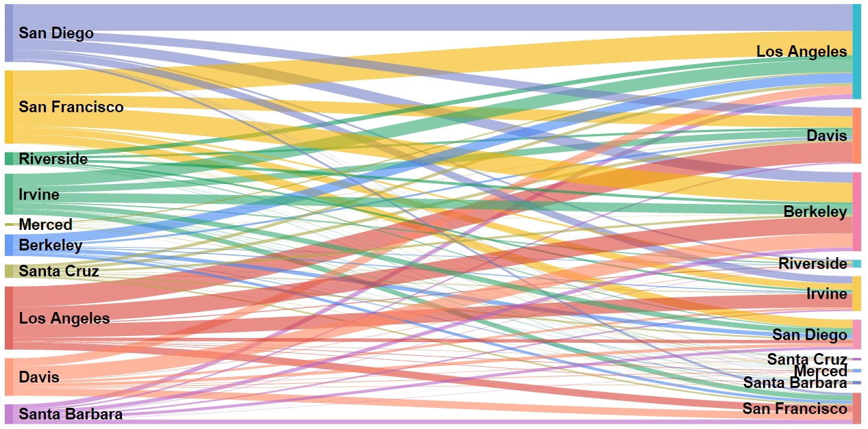
How does value flow between UC schools?
So far, we have been looking at each UC campus individually, independent of their connections to other UC campuses. But, there are fundamental links between campuses though which value flows over time. Let’s elaborate a bit.
There are many employees in our dataset who work at multiple UC campuses over our six year period. Employees may transfer from one UC campus to another for a variety of reasons: better pay, geographic relocation, a new job, etc.
Furthermore, there are many employees who are employed at multiple UC campuses within a year. How can this be? It is best explained as a symptom of the fact that our data is annual. For example, if an employee works at UC Riverside for the first half of 2012 and UC Merced for the second half of 2012, she will be recorded as working at both Riverside and Merced in 2012.
Let’s look at a real employee from the data. Hover over each bar to see salary information.
This employee started off at UC Los Angeles in 2010 and worked there for two years. In 2011, when the employee was still employed in Los Angeles for some part of the year, he began working at UC Santa Barbara. He continued to work there through 2014. In 2013, he started to work at UC Irvine and continued to work there into 2015. We see that this employee’s total income at each consecutive UC school went up over time.
If we assume that salary is a measure of how much value a campus gains from an employee, when an employee leaves a campus they reduce the net value of that campus by the amount of their salary. For example, if an employee makes \$50,000 at UC Irvine in 2013 and then accepts a position at UC San Diego in 2014, UC Irvine effectively loses \$50,000 worth of value via the loss of that employee. Note however, that this does not mean UC San Diego gains \$50,000 since they may value this employee differently.
Let’s take a look at how much value each UC school lost to each other UC school in our six year period. Hover over each link to explore the value flows between UC schools.
Some notes about this chart:
- UC Berkeley is generally ranked the highest in university rankings such as the US News & World Report rankings. While it is up to debate whether these rankings are at all accurate, they do definitely sway public opinion. This is a likely reason that in our chart, UC Berkeley loses very little value for a school of its size but is the target for a lot of value from other UC schools.
- We see that UC Los Angeles and UC San Francisco serve as the major sources of value loss with most of UC Los Angeles’ lost value going to UC Davis and UC Berkeley and most of UC San Francisco’s lost value going to UC Los Angeles and UC Berkeley.
- It is perhaps worth noting that geographic proximity might affect where lost value goes. For example, UC Irvine and UC Los Angeles are relatively close, which might be why most of UC Irvine’s lost value goes to UC Los Angeles. Employees perhaps look for jobs close to where they already are. We see a similar pattern with most of UC Davis’ lost value going to UC Berkeley.
How does salary correlate with other things?
As we started to talk about at the start of this post, salary is a function of many factors. The key questions are then “What are those factors?” and “How strongly do they correlate with salary?”
The tool below will help answer some of those questions. You can pick between three potential factors which might (or might not) correlate with salary and look at how these patterns change over time and also by job title.
Again, we’re pulling 1.5 million rows here, so if there isn’t a chart there, it’ll show up soon!
A few takeaways:
- There seems to be a (if only a slight) positive correlation between years of experience and salary, which we expect
- There seems to be a (again if only slight) negative correlation between city unemployment rate and salary. The logic is likely as follows. If unemployment rate in a city is high, employees are not as picky about how much they are paid to work. Knowing that jobs are scarce, employers also have less incentive to offer bigger salaries since they know employees don’t have many other options.
- The most fun of these graphs to explore is the graph of past year’s salary vs. this year’s salary. We see a very strong positive correlation, pretty much no matter what job we subset by.
- Here’s an interesting exploration. Pick 2015 and choose ‘nurse’ as the job title. Set your max displayed salary to something around \$250,000. Notice that for lower salary levels, there’s a much greater variability between last year’s salary and this year’s salary than for higher salary levels, where the relationship is much more linear. It seems like your salary is more stable the higher it is (at least for nurses).
Notes
- There are a lot of combinations of charts, graphs, and plots you can generate using the tools in this post, but it is important to remember the old adage: “correlation does not imply causation”. The relationships we talked about in this post are based on a mixture of past research, data, and intuition but may very well not be causal.
- The chart showing flow of value through the UC system has many assumptions including that salary is actually a measure of value to each UC school, that few employees were fired, and that each UC school is willing to hire employees who work part time at that UC school and part time at another UC school.
- If you are having trouble finding position titles, it is likely because they are so vague. Your best bet is probably to go to the UC Compensation website linked in the Data section of this post and look for the position title you want and then enter it into the tool.
Thanks for reading and please leave comments!